
GTKA4.0
is back! (That's right. We're cool enough to abbreviate now.) Welcome
to Part 5: Contacts. The Contacts app has seen the biggest change of any app from Gingerbread to Ice Cream Sandwich. Everything is different. It's not even called "Contacts" anymore, It prefers to be called the "People" app. We've got a lot to cover.
Unfortunately, unless you have a Nexus device (I don't), it's almost impossible to get a hold of a fully functional, stock Gingerbread contacts app. The closest I can get is a non-syncing emulator, which doesn't have enough options, and the Cyanogenmod 7 contacts, which has way too many options. So don't flame me too hard if my Gingerbread approximation isn't 100% accurate. But hey, who cares about Gingerbread? The whole point of this article is the new contacts app.
I will also probably talk a lot about Google+, but People is not "forcibly" connected to Google+. People has an open data API for social networks, and any app can integrate with it. So don't fret about being forced to sign up for G+ or anything, you don't have to.
Deep social network integrating is the biggest new feature. It still connects to Google contacts, but if you install the Google+ app and choose to sync contacts, it will pull pictures, info, and status updates from G+ too. They also demoed Twitter and Linkedin working at the ICS unveiling in Taiwan, but I'm not on either of those networks. Facebook doesn't work, but that's Facebook's fault. Hopefully someone will write a app for Facebook integration.
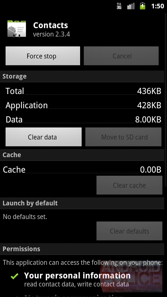
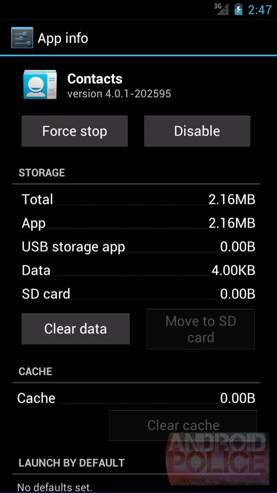
Time for the About screens:

 Hmm... Neither app has an "About" screen. That's new. Ignore the branding fail, the new app is
actually called "People," they just never updated it internally. We're
moving from 2.3.4 to 4.0.1, both of which are just the Android version
number.
Hmm... Neither app has an "About" screen. That's new. Ignore the branding fail, the new app is
actually called "People," they just never updated it internally. We're
moving from 2.3.4 to 4.0.1, both of which are just the Android version
number.


 It's
about time we pushed that search button that's been hanging around
everywhere. As usual there's the blue header and we FINALLY get to see
the People icon/back button. I just love the new results highlighting
(the green "Jess" in "Jessica"). It's a small touch but very good
looking.
It's
about time we pushed that search button that's been hanging around
everywhere. As usual there's the blue header and we FINALLY get to see
the People icon/back button. I just love the new results highlighting
(the green "Jess" in "Jessica"). It's a small touch but very good
looking.
There's now an "X" button in the search field that will helpfully erase your entire search term if you'd like to start over. Other than that, it's the usual ICS polish.
There is still almost nothing to speak of options wise, you get a mostly empty screen. There's just two options, sort and display by first or last name.
People takes on a much more visual, picture based design. Everything looks cleaner and is more polished. There's now a proper horizontal mode. It's a nice update and a huge improvement over Gingerbread.
Unfortunately, unless you have a Nexus device (I don't), it's almost impossible to get a hold of a fully functional, stock Gingerbread contacts app. The closest I can get is a non-syncing emulator, which doesn't have enough options, and the Cyanogenmod 7 contacts, which has way too many options. So don't flame me too hard if my Gingerbread approximation isn't 100% accurate. But hey, who cares about Gingerbread? The whole point of this article is the new contacts app.
I will also probably talk a lot about Google+, but People is not "forcibly" connected to Google+. People has an open data API for social networks, and any app can integrate with it. So don't fret about being forced to sign up for G+ or anything, you don't have to.
Deep social network integrating is the biggest new feature. It still connects to Google contacts, but if you install the Google+ app and choose to sync contacts, it will pull pictures, info, and status updates from G+ too. They also demoed Twitter and Linkedin working at the ICS unveiling in Taiwan, but I'm not on either of those networks. Facebook doesn't work, but that's Facebook's fault. Hopefully someone will write a app for Facebook integration.
Time for the About screens:
Contacts List

The
Gingerbread contacts app was a hybrid of Contacts and Dialer. The new
People app is just contacts. Dialer got spun out into its own app, but
that's a story for another day.
As usual in ICS,
we've switched from a black theme to a white one . The AMOLED battery
enthusiasts won't like it, but It looks much better. People is the only
ICS app I've seen that is infused with a color. The header(action bar)
is light blue; every other app has a grey or black header. It's also
missing the usual ICS icon/back button in the header. It looks out of
place compared to the rest of ICS, almost like a 3rd party app.
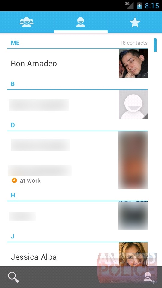
Across
the top of ICS there are tabs for Contact Groups, Contacts, and
Favorites. At the top of the contacts list, there's a "Me" contact, with
the personal info it pulled from my Google+ account. Tell me, why do I
want a "Me" contact? All they said at the ICS unveiling was "this is my
phone, and it should know who I am." The thing is, ICS doesn't do
anything with this information. Maybe apps will use it?
I am very
happy to see Google Talk status show up somewhere, It is now right
below the names (the orange circle) of your contacts, along with their
statuses. Very cool.
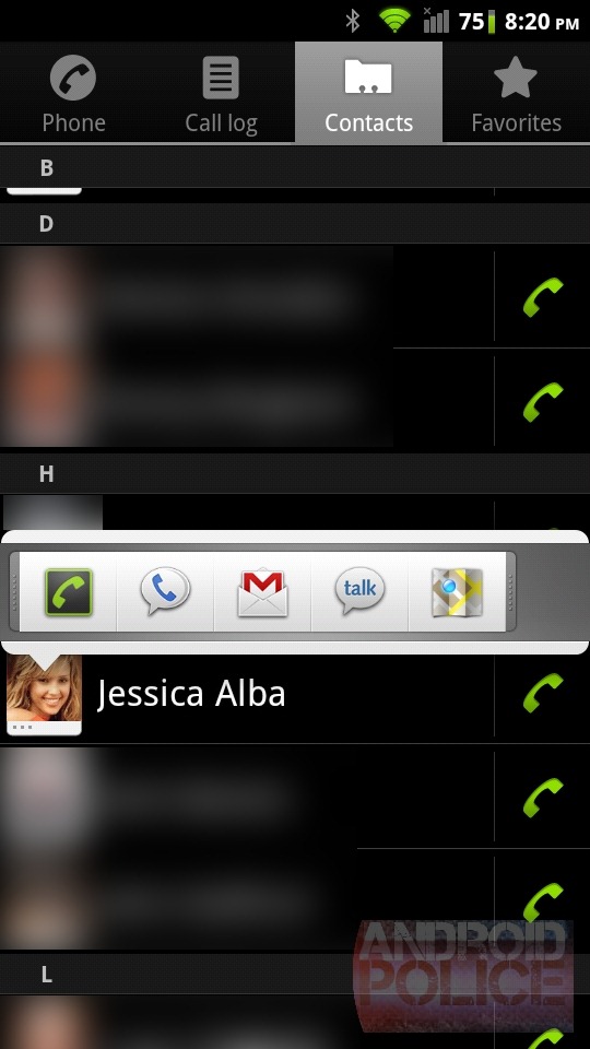
Along the bottom you have more Action Bar. There's search and add contact. More exposed menu options is always good.
I believe the dial buttons are a CM7 extra, In the Gingerbread emulator they are only present in the favorites tab. Sorry about that.


This
is the Gingerbread contacts app in landscape. No, I'm not kidding. The
contacts list just had no landscape support at all. It's really horrible
when you're locked into a car dock and trying to make a quick phone
call, and everything is sideways.
Luckily, the People
app corrects this with a proper landscape mode. Good job on finally
supporting a feature that has been around since Android 0.8. (as usual,
ignore the horrific emulator landscape rendering).
You
can also see the Action Bar get its cool "combine" feature going, the
bottom bar merges with the top for more vertical space in horizontal
mode. Very cool.
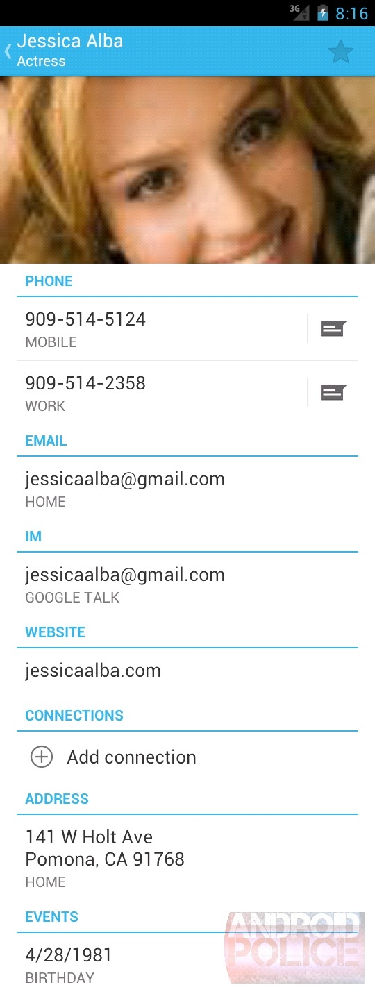
Contacts Cards
Contact
cards show up when you touch the picture of a contact. It works all
over the OS, just like Gingerbread. In ICS though, the cards have gotten
a huge upgrade. You now have a giant picture at the top, along with
transparent bar showing the contact name and a button for the contact
page on the right. You can touch or swipe through the options for easy
access to everything in a normal contacts page. Social networks will
show up here too, but Jessica isn't in any. She's shy.
I
am having serious issues with the pictures. ICS refuses to download
high resolution versions, even though I added a super high res picture
to contacts. Google either needs to flip a switch on everyone's account
to allow higher res pictures, or I'm not getting a full G+ sync.
Hopefully Google Contacts has been keeping the higher res versions of
the pictures we've all uploaded.

Contact cards are even bigger in landscape. Look at that artifacting! We're gonna need some bigger pictures.
Favorites and Groups
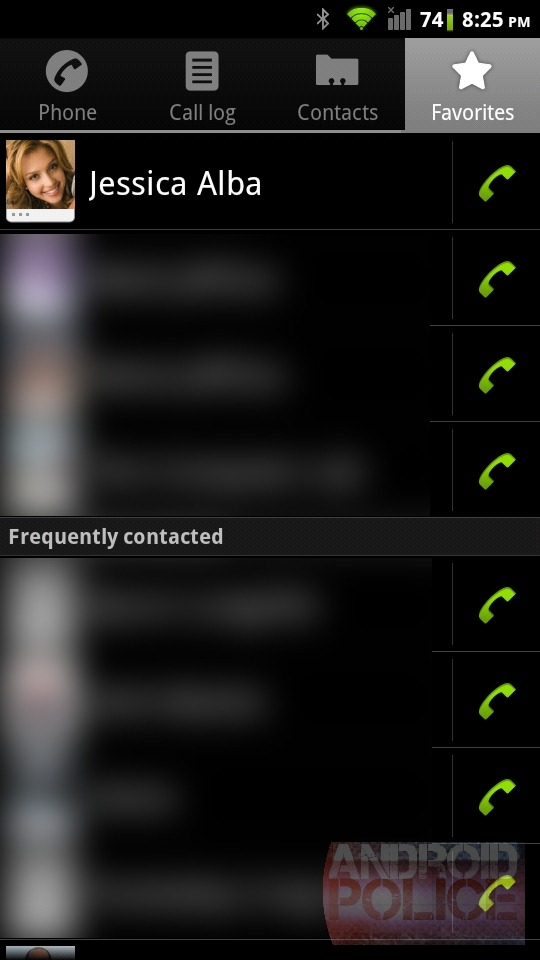

The favorites tab gets a totally new layout. Instead of the normal list of contacts, you get big tiles
pictures and a name. You can see more picture shenaniganry here:
Jessica has a picture but it isn't showing up. Below the names you also
get Google Talk status! Personally I can't have enough status dots. Put
them everywhere.
That bottom action bar with one
button on the bottom is really lame. They really couldn't squeeze that
in anywhere else? The horizontal action bar handles the tab/button combo
beautifully. I am really going to miss that hardware search button.
"Frequently contacted" shows up below the giant pictures in list form. I just haven't frequently contacted anyone.

The
left tab brings up this screen. At the top you have the groups from
Google Contacts, below that are my G+ circles. Tapping any one of them
will bring up a favorites style screen of those groups with big giant
images. The "Google" contacts will bring up their contacts page, and the
G+ circles will load the Google+ app and show their streams.
Individual Contact Page

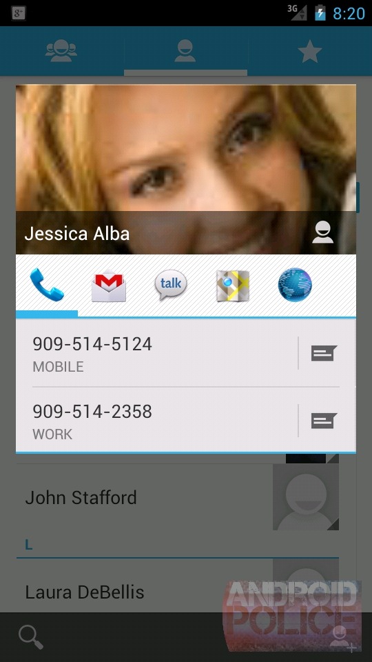
Here's
an actual contact page, and Yikes! These two screens show (about) the
same about of information. ICS spends a lot of screen space on a giant
picture and headings above communication type. Still, I find little
reason for Gingerbread's information density. 99% of the time you are
looks up a contact for phone numbers or email, both of which still end
up on the first screen. No scrolling necessary.
"Connections"
is the one new item; they should probably rename it "Social Networks."
You'll see any social network accounts the contact is associated with.
On
a social network connected contact, you'll be able to swipe left here
and see social network updates from your contact. (It's not working in
the emulator though, G+ crashes all the time)
Editing Contacts

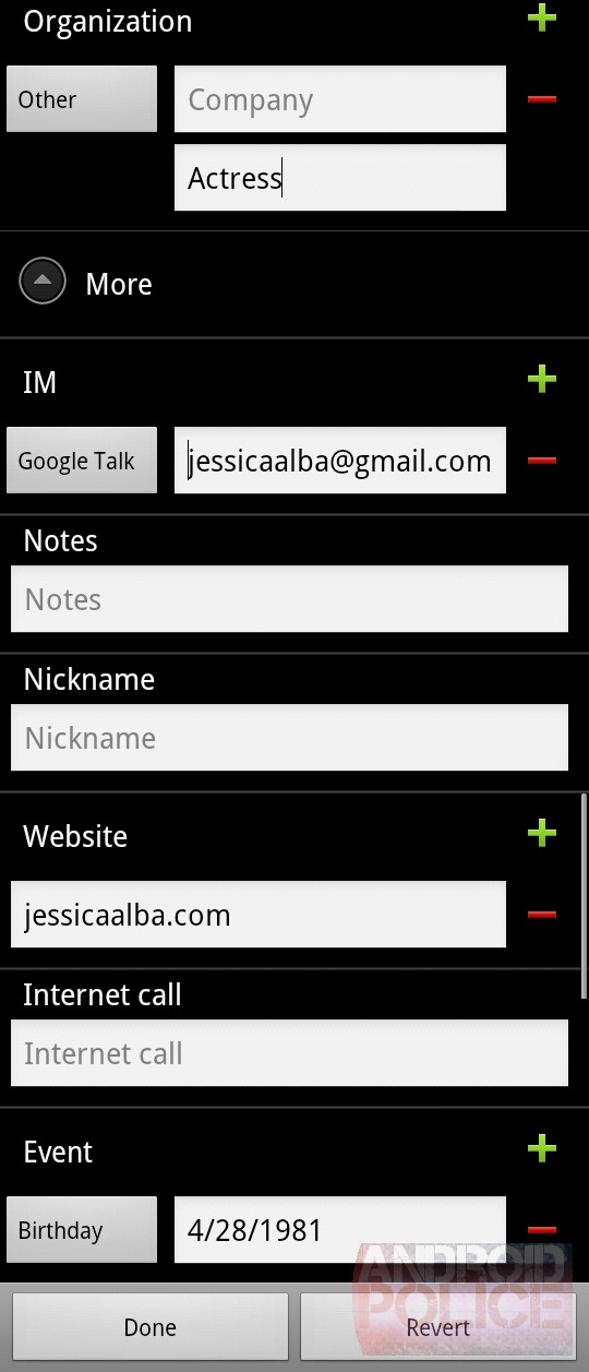
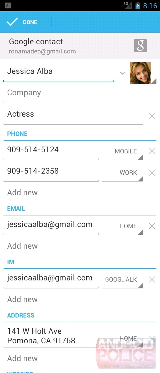
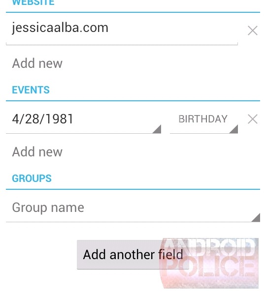
Editing contacts is the complete opposite of viewing one. Here ICS manages to condense the screen more
than Gingerbread. ICS will automatically hide unused sections, so while
Gingerbread is wasting space with unused "Notes," "Nicknames," and
"Internet Call," fields, ICS neatly tucks them away under the "Add
another field" button.
The "Done" button lives at the
top of the screen now. It is pinned to the screen, (like the "Done" and
"Revert buttons in Gingerbread) so you can always find it. "Revert" is
totally gone. The back button will also save your changes, so the only
way to cancel your changes is to hit menu and "Discard." I personally
never "accidently" change a contact and need to discard changes,
hopefully everyone else is the same. Really though, that header is
awfully empty, there would be plenty of room for a revert button.
Just
about everything has been switched around. The categories
(Home/Work/Mobile) have moved to the right side, and are now in-line
drop down boxes instead of full screen dialogs. The colored plus and
minus buttons were axed for classier looking "x" and "Add new" buttons.
"Address"
was switched from 4 separate fields in GB to 1 paragraph-style field in
ICS. The separate fields in Gingerbread made entering an address more
work than it should be. There's no tab button, remember, so it meant
typing a small part of the address, then moving the cursor. Maps is
smart enough to figure out 1 line input anyway, so I'm not sure why they
ever decided to split it up in GB.

There is one new feature here: You can edit contact groups now (thanks Rita). Touching it brings up a set of checkboxes, and you can add or remove a contact from your groups.
Search

There's now an "X" button in the search field that will helpfully erase your entire search term if you'd like to start over. Other than that, it's the usual ICS polish.
There is still almost nothing to speak of options wise, you get a mostly empty screen. There's just two options, sort and display by first or last name.
Wrap Up
What a massive difference. People is now a contacts and social network aggregator. When you can combine contact info from Gmail, Google+, Facebook, Twitter, and Linked-in, you will never have out of date contact information.People takes on a much more visual, picture based design. Everything looks cleaner and is more polished. There's now a proper horizontal mode. It's a nice update and a huge improvement over Gingerbread.


0 comments:
Post a Comment