
For many people, Gmail is Android's killer app. It's the best email
app on any platform, and one of the biggest draws to Android. So anytime
there is a change, it's pretty big news. With Ice Cream Sandwich, Gmail
got a huge revamp. Every inch of the app has changed. Today we're going to find out just what is so different.
I'm sure you've read other articles on the new ICS apps, but those are just rehashing what was shown in the Hong Kong demo. With the recent system apps dump and some SDK shenanigans, we can sit down with a real, working version of Gmail 4.0 and uncover its secrets. Email fanatics, this article is for you.
A few notes before we get started: These Ice Cream Sandwich shots are from the emulator. The emulator's rendering is not 100% accurate, so if something looks wrong, it probably is. Gingerbread is on the left, and Ice Cream Sandwich is on the right (you can also tell by the blue/green status icons). All screenshots are 960x540, so any information density discrepancies (number of messages, text size, etc) are accurate.


 Checkbox
usage is much better in ICS. Checking an item helpfully highlights the
whole message, and you get a "number of checked messages" counter at the
top, which will let you know if a checked item is off-screen. Pressing
on the "# Selected" check at the top will clear your entire selection.
Checkbox
usage is much better in ICS. Checking an item helpfully highlights the
whole message, and you get a "number of checked messages" counter at the
top, which will let you know if a checked item is off-screen. Pressing
on the "# Selected" check at the top will clear your entire selection.
You also get more readily available options along the bottom: Archive, Delete, Labels, Mark as Read/Unread (the envelope opens and closes), Star, and Menu. In the menu there is Mark as Important/Not Important, Mute, and Report Spam. You might not have guessed the envelope icon was "Mark as read" at first glance, but Google's got that covered. Long pressing on the button will bring up a tooltip, just like a mouse hover would on a desktop. It's very slick.
The Menu button (the 3 vertical dots) will appear and disappear in these screenshots as needed for options overflow, but on the Galaxy Nexus (which has no system level menu button) it is a permanent fixture in every screen.

 How
is this for strange? In landscape, the buttons are displayed at the
top. It's actually very space efficient. Gingerbread has the normal
header at the top and buttons on the bottom, which limits the
amount of space for messages and feels a little claustrophobic. With the
new design, ICS manages to have the same amount of messages yet it
shows you more of each message.
How
is this for strange? In landscape, the buttons are displayed at the
top. It's actually very space efficient. Gingerbread has the normal
header at the top and buttons on the bottom, which limits the
amount of space for messages and feels a little claustrophobic. With the
new design, ICS manages to have the same amount of messages yet it
shows you more of each message.
One oddity though. Horizontal gives you more space for buttons, but here ICS is displaying 1 fewer option than portrait - design or bug?


 Now
Gingerbread is really getting outclassed. The first picture shows
Gingerbread's all-text version of a contact. Touching it brings up the
keyboard, even though it matches what is listed in contacts. In ICS, if
it recognizes a contact, you get a very nice looking name and picture
tag that is also a button. Touching the tag (picture 3) shows
you the email address, and gives you the option to remove it (the "x" in
the tag). Picture 4 shows what an unrecognized contact looks like
(art@gmail.com), touching it brings up the keyboard so you can edit it.
Now
Gingerbread is really getting outclassed. The first picture shows
Gingerbread's all-text version of a contact. Touching it brings up the
keyboard, even though it matches what is listed in contacts. In ICS, if
it recognizes a contact, you get a very nice looking name and picture
tag that is also a button. Touching the tag (picture 3) shows
you the email address, and gives you the option to remove it (the "x" in
the tag). Picture 4 shows what an unrecognized contact looks like
(art@gmail.com), touching it brings up the keyboard so you can edit it.
Oh, and if you were wondering what the deal was with all the red underlines, that's ICS's spell checker. Touching a word brings up the list of suggestions. "Get" is most definitely a word, but the dictionary in this build is messed up. It's not released yet for a reason, folks.

 Try not to giggle. The current version of Gmail really does
look like this. It's embarrassing next to the new version, isn't it?
The whitespace gives us a more readable list and a little vertical
compacting cranks the viewable labels from 9 all the way to 11.
Try not to giggle. The current version of Gmail really does
look like this. It's embarrassing next to the new version, isn't it?
The whitespace gives us a more readable list and a little vertical
compacting cranks the viewable labels from 9 all the way to 11.
What is up with the old label color box? What is this, baby's first smartphone?

I'm sure you've read other articles on the new ICS apps, but those are just rehashing what was shown in the Hong Kong demo. With the recent system apps dump and some SDK shenanigans, we can sit down with a real, working version of Gmail 4.0 and uncover its secrets. Email fanatics, this article is for you.
A few notes before we get started: These Ice Cream Sandwich shots are from the emulator. The emulator's rendering is not 100% accurate, so if something looks wrong, it probably is. Gingerbread is on the left, and Ice Cream Sandwich is on the right (you can also tell by the blue/green status icons). All screenshots are 960x540, so any information density discrepancies (number of messages, text size, etc) are accurate.

We
might as well start with the version numbers. We're moving from 2.3.5.2
all the way to 4.0. We also get our first look at the new "Roboto" font
that's supposed to be so amazing. I wouldn't judge it until you see it
on actual hardware.
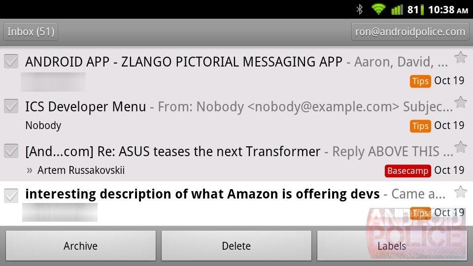
Inbox
Here's my AP inbox on both versions of Gmail. The messages are exactly the same.


The
most obvious change is the switch from to a 1 line preview to a 2 line
preview. They've also shrunk the preview font size. You see 2 less
messages overall, but more of each message. A good example is the Kindle Fire
email (6th from the top). In Gingerbread (left) we have no idea what
the message is about, but in ICS (right) we have enough information to
take action.
Another change is the swapping of sender
and subject. In ICS the sender is now the most prominent information.
It's also easier to see the "important" mark (the double chevrons) from
priority inbox, and the checkboxes are much easier to understand without
the ghosted check mark in unchecked items.
A new UI style in ICS
is an almost constant row of buttons along the bottom of an app. Google
is out to kill it's own Menu button with Ice Cream Sandwich, so you'll
see a general theme of more options being exposed instead of being
buried in the menu. Here the buttons are "Compose", "Search", "Labels",
and "Refresh". Refresh also changes to a spinning throbber to let you
know when a sync is happening. It syncs just about any time your finger
hits the screen.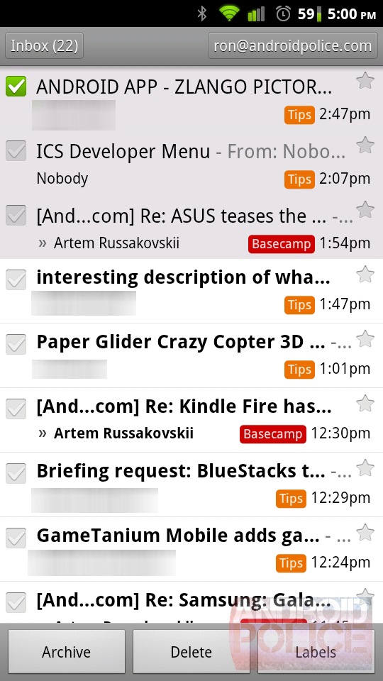

You also get more readily available options along the bottom: Archive, Delete, Labels, Mark as Read/Unread (the envelope opens and closes), Star, and Menu. In the menu there is Mark as Important/Not Important, Mute, and Report Spam. You might not have guessed the envelope icon was "Mark as read" at first glance, but Google's got that covered. Long pressing on the button will bring up a tooltip, just like a mouse hover would on a desktop. It's very slick.
The Menu button (the 3 vertical dots) will appear and disappear in these screenshots as needed for options overflow, but on the Galaxy Nexus (which has no system level menu button) it is a permanent fixture in every screen.

One oddity though. Horizontal gives you more space for buttons, but here ICS is displaying 1 fewer option than portrait - design or bug?
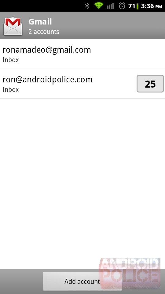

The
"Inbox" header at the top is actually a button. Touching it lets you
quickly switch between accounts, it shows you how many unread messages
you have in each account, and it lists your most recent labels. The drop
down menu is way cooler than Gingerbread's full screen (yet empty)
implementation.

The toast messages in ICS look much better, and it is much more obvious that "undo" is a button. The toast messages in Gingerbread hang around forever,
or you can tap to dismiss. In ICS the message goes away as soon as you
touch the screen. I'm not really sure if this is a good thing, It would
be nice if the undo option could be accessed from the menu.
Reading Mail

Wow. Look at those sexy, sexy margins. I could read that all night long.
I
must say, I really prefer Gingerbread's stacked subject/label layout
over ICS's side by side version. If you have long or nested labels the
name wraps and looks terrible. Plus the Stacked layout just seems to use
space more efficiently - you don't need the huge amount of whitespace
between the subject and labels in a stacked configuration. I'm also not
entirely sure what the point is of the partial subject in the header,
followed by the full subject right below it.
"Show
details" was another one of those buttons-that-don't-look-like-buttons,
so it was moved next to the date as a down arrow. That section expanded
anyway, so a down arrow makes much more sense.
The
"Newer - 3 of 3" line towards the bottom is telling you to can swipe
left or right move to a newer message, similarly to how Google Talk
works. If I had an older message than this in my inbox, "Older" would be
displayed on the right side as well. The left and right buttons from
Gingerbread get the axe because gestures are more fun, which makes room
for more options and less menu digging.

There
is a lot more "float" UI going on in the new Gmail. Here the subject
header and the sender header stick around while you scroll. between that
and the whitespace you are going to see slightly less of your message.
Horizontal isn't as bad as you would think, the bottom buttons merge
with the subject header like I showed earlier. You actually get a little
more text with ICS's horizontal view. If you this is too much floaty
stuff for you, the blue part is optional. You can make it scroll with
the rest of the message in the options.
The Gmail
icon in the top left is the combination logo/back button from Honeycomb.
It's an app-level back button, as opposed to the regular, system-level
back button. If you jump to this screen from a notification, the regular
back button will take you back to whatever you were previously doing,
but the Gmail icon will take you the previous screen in this app, which in this case is the inbox.

Can
I just take a moment here to thank Google for getting rid Gingerbread's
'more options' style? The new menu has a drop shadow, which makes it
look like it is above the message and not permanent. Gingerbread's
"style" just looks like a layout error. The 3 vertical dots always bring
up a menu like this, so if i haven't screenshotted every instance of
it, just use your imagination.

Here
you can see the new threaded view and what happens when you expand
"Show details". The new layout allows for a denser display of
information yet it is actually easier to read. Good job, Googlers.
Some
fields still display the email address in the intensely stupid
"email@gmail.com, <email@gmail.com>" format - even when that
person is in your contacts. I've never seen it be anything other than
redundant.
Compose
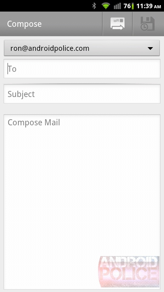
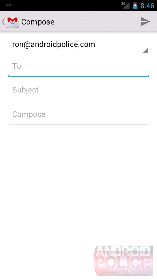
Gingerbread's compose screen really looks
like crap compared to the new one, doesn't it? ICS borrows heavily from
the Honeycomb version of Gmail, ditching the boxy design for a more
"open" feel. The send button (which, for some reason, I could never
really associate with "send") is redesigned to an arrow... thing. Which I
don't think is any more clear. Every other email client in the world,
including desktop Gmail, has the word "Send" in a box. That's normal.
This isn't.
The "Save" button got the axe, because
saving happens automatically. The compose field might look a little
restricted, but it expands with your message.
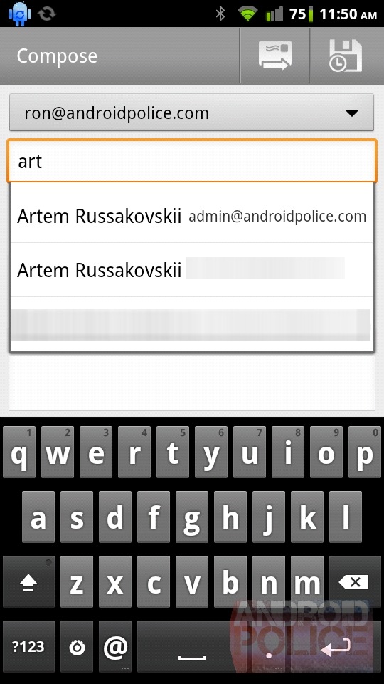

The
instant contact search list is much nicer looking (and, somehow, more
thorough, those are all different AP addresses). Just about everywhere
there is a name ICS will try to tack a G+ picture next to it. On one
hand it encourages everyone to sign up, but it's also just more helpful
for identifying contacts - and prettier. Ignore the differences in
keyboard sizes, that's not the stock GB keyboard.


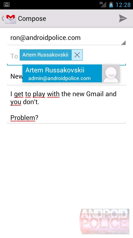
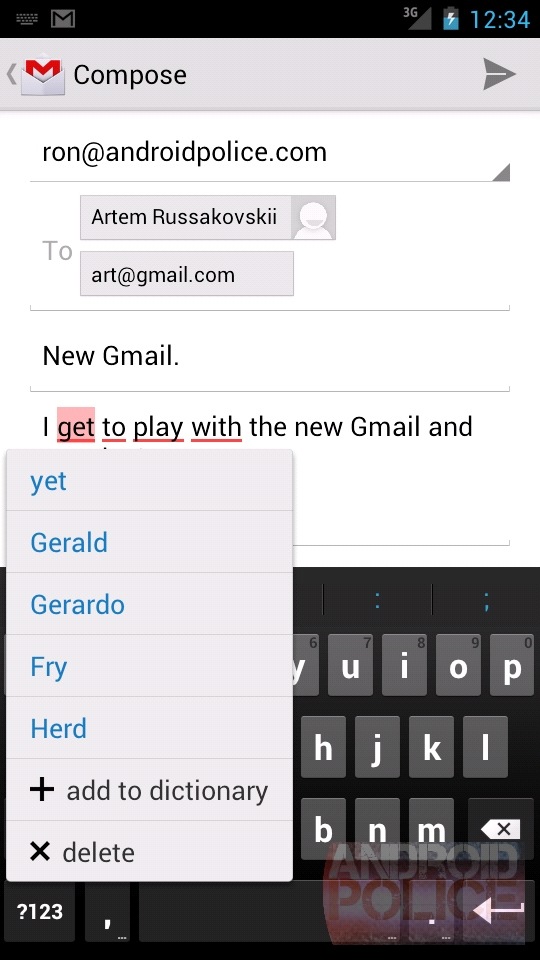
Oh, and if you were wondering what the deal was with all the red underlines, that's ICS's spell checker. Touching a word brings up the list of suggestions. "Get" is most definitely a word, but the dictionary in this build is messed up. It's not released yet for a reason, folks.
Labels

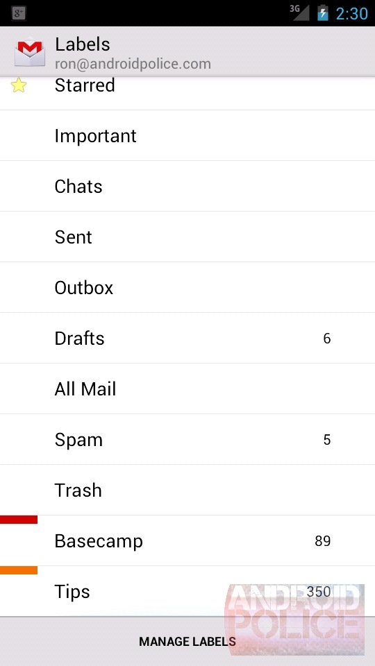
What is up with the old label color box? What is this, baby's first smartphone?
Settings

You
can't say I'm not thorough. Pay attention to the heading on each
screenshot (general vs per account). It seems like most of the behavior
options (confirmations, auto advance, batch operations) have been moved
from per account settings to general settings. That will force
consistent behavior across your accounts, the question is, do you want consistent
behavior across accounts? I can easily see wanting a confirmation on an
important account, and not wanting a confirmation on an unimportant
account.
The ICS list is longer, so again we see the theme of exposing more options instead of hiding them behind popups or menus.
Also check out the last option, Auto-Download Attachments!


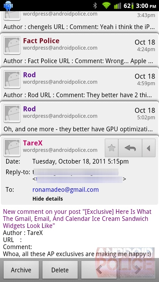
0 comments:
Post a Comment