

With each new major release of the Windows operating systems,
Microsoft has traditionally reworked its logo, which over the years has
morphed from an angular design to one in which the window incorporated in the logo looks a lot like a flag. With Windows 8, the company
is again changing the logo, this time to a monochromatic angular style
to mimic the overall design directive of the operating system itself
known as Metro. Here is a sampling of Windows logos since Windows 3.1
that the company included in its Windows Team blog along with the explanation of what the company was trying to say with the images.

This is what Microsoft calls the first Windows logo, and here’s what the company
blog has to say about it: "Few remember the original Windows logo, yet
we found it both refreshing and inspiring in relation to the work we
have been doing on the Metro style design visuals. Using simple lines
and clear straight forward concept, this logo reminded us of what a
great and evocative name we have with 'windows.'"
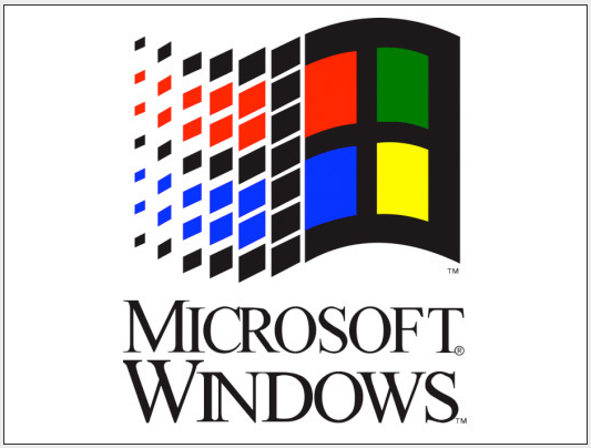
After a few years, the company updated the logo, adding color and motion. From the blog: "For many of us this was the image
in our mind when we think of past Windows logos. The now classic window
shape and the introduction of the four colors were hallmarks of the
Windows brand for many years to come. The introduction of the 'waving
effect' gives the logo a sense of motion. This logo would be the basis
of the Windows versions throughout the 1990s."

The blog skips over Windows 98 and its logo, which adds the actual name of the Windows operating system. It incorporates the same wavy window graphic that stuck with the product for more than 10 years.

Again, the blog doesn't address the Windows 2000 logo, but it incorporates boldly colored individual panes distributed behind the wavy window. This is the logo with the most elements to it; afterward the company seemed to strive for cleaner designs.

With the advent of the popular Windows XP, the company
again made a significant change. The blog skips over Windows 98 and
Windows Millennium logos, but says this about the one for XP: "What has
come to be known as the 'Windows flag' is a cleaner more sophisticated
mark than its predecessors. The version that populated the lower left
hand corner of Windows PCs next to the word 'Start' also gained a sense
of materiality (plastic?) and a 3D effect from the rich gradients and
shadows."

For Windows Vista and Windows 7,
the logo dropped words altogether and concentrated on the visual
effects that could be accomplished with newer PCs. The blog says:
"Replacing the green Start button was the round glass-like button with a
now flattened version of the 'flag' from Windows XP. Internally, this
icon became known as the 'pearl.' You can see the intricate lighting effects
of the faux glass. In many ways signaling just how powerful of a
rendering engine the PC had become. This version of the logo was largely
unchanged for Windows 7."

"1. We wanted the new logo to be both modern and classic by echoing the International Typographic Style (or Swiss design) that has been a great influence on our Metro style design philosophy ...
"2. It was important that the new logo carries our Metro principle of being 'Authentically Digital.' By that, we mean it does not try to emulate faux-industrial design characteristics …
"3. Our final goal was for the new logo to be humble, yet confident. Welcoming you in with a slight tilt in perspective and when you change your color, the logo changes to reflect you."
Source:NetworkWorld.com


0 comments:
Post a Comment